Widgets Overview
Widgets are the individual building blocks placed on a Dashboard. They are responsible for fetching data and presenting it visually to the user.
Types of Widgets
Jet Admin includes a rich library of ready-to-use widgets:
Data Visualizations (Charts)
Powered by Chart.js, these widgets are perfect for analytical reporting.
- Bar / Line Charts: For comparing categorical data or viewing trends over time. (Requires
xAxisandyAxisfields). - Pie / Polar Area Charts: For showing proportional relationships or market distribution. (Requires
labelandvaluefields). - Radar / Scatter / Bubble: Advanced charts for multivariate analysis.
Data Displays
- Data Table: Render thousands of rows of query results with sorting, pagination, and filtering out-of-the-box.
- Text / Markdown: Display static headers, instructions, or dynamic markdown content.
- Custom HTML / iFrame: Embed external applications directly into your dashboard.
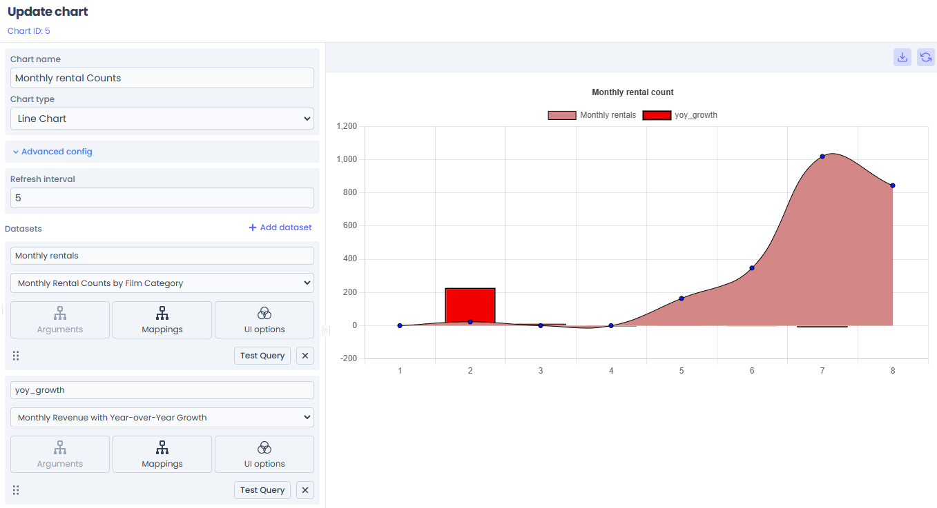
Configuring a Widget
After dragging a widget onto your Dashboard, you must configure it to display data.
1. Data Source Selection
A widget needs to know where to get its data. You can bind a widget to two sources:
- Direct Query: Connect the widget directly to a saved Data Query (e.g., a "Get Users" SQL statement). The query executes, and the raw rows are returned to the widget.
- Workflow (The Bridge): Connect the widget to a full Workflow. This is the recommended approach for complex data that requires transformation (e.g., formatting dates or aggregating totals in JavaScript) before charting.
2. Parameter Mapping
If your underlying Query or Workflow requires parameters (e.g., it filters by {{args.status}}), the Widget configuration panel will dynamically generate input fields for those parameters.
You can hardcode these values (e.g., always pass "active"), or in future updates, bind them to other interactive UI elements on the dashboard.
3. Field Mapping
Once data is returned, you must tell the widget how to read it.
- For a Bar Chart, you map the "X Axis Field" to a column returned by your query (e.g.,
month), and the "Y Axis Field" to the value (e.g.,revenue). - For a Table, columns are auto-generated from the JSON keys, but you can hide or format specific columns.
4. UI Customization
You can tweak the visual presentation:
- Change chart colors, hide legends, or adjust axes limits.
- Enable auto-refresh intervals for real-time operational displays.
Real-Time Updates (WebSockets)
Jet Admin widgets are inherently real-time. When a widget runs a long-running Workflow, it subscribes to a WebSocket channel linked to that specific execution instance.
As the workflow progresses through its backend nodes, the platform streams the final transformed data directly to the widget, which animates and re-renders instantly without needing a page refresh.
Read more about this architecture in the Widget-Workflow Bridge documentation.